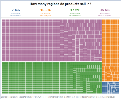
Last night I completed the #WorkoutWednesday challenge for Week 17 using Tableau. Having started to experiment with Microsoft Power BI, and joining up with some user groups, I thought I’d see how my skills were progressing in the newest tool.
Quickly I found I still needed a bit to learn, and the requisite Google (perhaps I should have used Bing) of how to do Level of Detail calculations in Power BI didn’t turn up useful answer. Power BI uses DAX (data analysis expressions) to calculate measures and columns. Initially I just knew there had to be a way, there were way too many functions available to not be able to achieve this. In fact, I knew this was going to be easy, and again shock me at how great a product Power BI is, and had been right there all along, just waiting for me to pick it up and try my hand at it.
Goodbye evening, as the hours passed hope left me. There did not appear to be a way, using groupby, SUMMARIZE, SUMMARIZECOLUMNS, and whatever else I tried.
Frustrated, and tired, yet still waiting to deliver this, I resorted to writing my own SQL on the original data set, saving the results to CSV and connecting this back to Power BI. The treemap I got pretty darn close, I’ll say. Not bad, Power BI.
Where Tableau really excelled was in my ability to format the entire dashboard, and every element within. It should, it’s a data visualization tool, and it won out the visualization, easily. I know, I know, Power BI is a visualization tool. And it really is, the vizzes are pretty darn good and straightforward. The KPI and related viz types are pretty killer for business use, easy to bring over the ‘stat heads’ and ‘financey’ people using those items. But the overall look and feel, that control is not there in Power BI.
Here they are.
Power BI (embedded dashboard is below)

Tableau