Week 18’s #WorkoutWednesday challenge has a lot of potential in varying applications. The challenge was to show/hide visualizations based on a set of navigation icons. This gives the user the appearance of activating vizzes by clicking the related icon, but without loading a new dashboard.

Gasp. From Tableau to Power BI?!
This is not a move away from Tableau, but it’s a move to see what else is in the space, and to broaden my skill set further. I’ve been adding a lot lately: adding to Python, building up R, improving visualization techniques, implementing machine learning, and even adding to my own server collection… one more add seems like fun to begin to pickup over a weekend. It rained most of today, so why not be productive and learn whilst stuck indoors…
A few months back I’d purchased a (used) Dell PowerEdge T310 Server. I came across one in a search where the price was right to give this a go. Currently, I run one home server with a personal home page, file server, etc. Whereas the first one was limited as it’s a compact version, running hardware that’s a few years old, and a little under powered to do much more than serve up movies via Plex.

Ahhh, week 16’s challenge takes me back to my early days with Tableau. My eagerness to master Tableau had me watching all of the Tableau-provided training videos. I’d recalled the Bollinger Bands charts from the advanced charting section. I do a bit of financial analysis at my day job, but I’d not yet put one of these to use within Tableau. Knowing fully how well Tableau handles moving averages with table calcs, I figured this to be a breeze.
Finally! A week where I got stumped but for less than 5 minutes. A good feeling, but as Andy says, this week will be “pretty easy”. Easy enough, I suppose; still a good mental workout.
The challenge this week was to create one chart with two representations of data; one using a Level of Detail express and the other a Table Calculation.
I’m writing this post simply off my own work; I’ve not yet dared download Andy’s workbook – I want to enjoy the feeling of conquering this weeks’ challenge before I discover how much more elegantly he solved for this. That’s the fun of these challenges and Tableau – multiple paths to solve for the problem at hand.
Week 10. Another week’s challenge, and another oh so close reconstruction of the visualization. Here, I set a personal best to re-creating the entire dashboard; except it took me over an hour to get the ‘size of hex’ parameter to work.

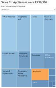
Another week (working backward) and another #WorkoutWednesday I was sure I’d solve. The challenge for week 12 was to allow for a highlight within a treemap. Initially didn’t seem all that practical, but seeing the power of this – with the user able to select/highlight within the treemap – I may end up using this one.
Another week, another confident beginning…
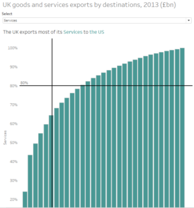
Week 14‘s challenge was to create a Pareto chart, and use this to determine whether or not UK exports hold to the Parerto Principle. I like the simplicity of the outcome of this one, and I’ve some thoughts on where I’ll employ similar concepts.
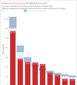
My third #WorkoutWednesday ever, yet the 13th of 2017, gave me such excitement at first glance – I was sure I could nail this one in an hour’s time. The author’s comment “[t]his shouldn’t be too terribly challenging” boosted the confidence. It still knocked me around a bit.
The full details of the challenge are at vizwiz.com, the short of Benford’s law is that the distribution of the first digits of real-world numbers are not evenly distributed. Meaning, the numbers 1-9 are not represented equally as the leading digit in a number. Reading it, processing it, it was a quick “well, of course!” Identification numbers, account numbers, etc – you start with 1 and count up!